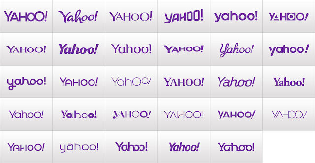
Back in August Yahoo announced a 30 days of change campaign. Each day, Yahoo would be changing it's logo in anticipation for the final rebrand. After much publicity and build-up the new logo has been introduced and was designed by Mayer herself and Yahoo's in-house design team.
The original tease video of 30 days of change.
Well, there it is. The new Yahoo logo. I thought it was interesting that CEO Marissa Mayer felt the need to design the logo, because it reminds me of the Google logo as it was designed by it's founders. Many people were upset with this new logo, they thought it was too boring for all the build-up. I think it's not bad considering the CEO was involved in the design process. It is simple and minimal, with a tad bit of quarkyness.
The biggest benefit to the new logo is that Marissa Mayer is taking ownership of Yahoo, she is taking the lead. So from a branding standpoint, Marissa is re-energizing Yahoo employees and showing them she is steering the boat.
The original tease video of 30 days of change.
The new logo will be a modern redesign that’s more reflective of our reimagined design and new experiences. To get everyone warmed up, we are kicking off 30 days of change. Beginning now, we will display a variation of the logo on our homepage and throughout our network in the U.S. for the next month. It’s our way of having some fun while honoring the legacy of our present logo. We also want to preserve the character that is unique to Yahoo! — fun, vibrant, and welcoming — so we’ll be keeping the color purple, our iconic exclamation point and of course the famous yodel. After all, some things never go out of style.
The biggest benefit to the new logo is that Marissa Mayer is taking ownership of Yahoo, she is taking the lead. So from a branding standpoint, Marissa is re-energizing Yahoo employees and showing them she is steering the boat.


No comments:
Post a Comment